Image motif:
Leaps in scale and change of material in the design
(Construction site residential buildings Klosterneuburg 2024, Handmade textile design 2024).
LIMINAL SPACES
Exhibition open until April 17, 2025,
every Thursday from 3 — 6 p.m.
and by appointment: kontakt@SchuberthundSchuberth.at
or with Insta-direct message
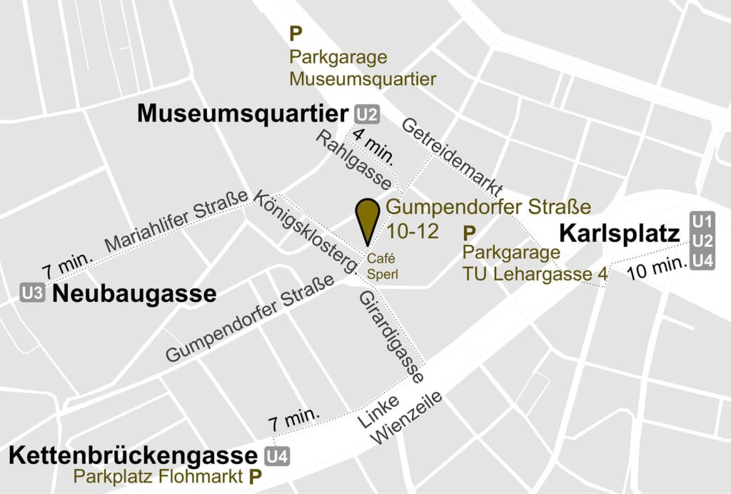
PORTIER, Gumpendorfer Straße 10–12, Top 1, in 1060 Vienna
LIMINAL SPACES
Exhibition open until April 17, 2025,
every Thursday from 3 — 6 p.m.
and by appointment: kontakt@SchuberthundSchuberth.at
or with Insta-direct message
PORTIER, Gumpendorfer Straße 10–12, Top 1, in 1060 Vienna
The new homepage is ready!
To relax, we like to make our own little animations. Here is a current selection
about our exhibition
” here to listen
Exhibition open until April 17, 2025,
every Thursday from 3 — 6 pm
PORTIER, Gumpendorfer Straße 10–12, Top 1, in 1060 Vienna
Further appointments by appointment: kontakt@SchuberthundSchuberth.at
We are delighted to have been shortlisted for the State Prize for Design 2024
in the “Spaces & Environment” category!
“More about the project: Garage Windmühlgasse
” Exhibition at the Design Forum Vienna from 17.05–03.07.2024
How can existing cores be densified without shifting the scale?
» Weidling residential complex
» Residential buildings Klosterneuburg
We have included current projects and reorganized the categories. In the “studies” we think about color, font and everything that doesn’t fit anywhere else.
And of course our mobile version has also been revised!
Color — light — room atmosphere
In dialogue: Gregor Schuberth and Thomas Hellweg, XAL
Friday, March 3, 17:45 in the Radio-Kulturhaus.
” TURN ON
Opening: February 22, 2023, Natural History Museum Vienna Burgring 7, 1010 Vienna
Exhibition design and development of the interactive stations
Curation: Mathias Harzhauser, Agnes Maier, Julia Landsiedl (Design NHM)
” NHM Vienna
” read more
We like to make our own little animations to relax.
” Here is a selection of our favorite films
” favorite 2022: The New Jolly
Christoph Panzer photographed the new Siegfriedgasse city apartment building project for us.
” read more
” here on YouTube
As places, garages are pure in-architecture. They should be clear, safe and pleasant. We were able to test this in Parkgarage Freyung in Vienna. Each floor is kept in its own pastel shade. Important transitions are marked with black mosaic tiles.
” read more
” here on YouTube
Award for juice bar in the Opernpassage
“The City of Vienna — Architecture and Urban Design (MA 19) presents high-quality architectural projects completed in 2021 in the “gebaut 2021” exhibition. The “gebaut 2021” architecture prize was awarded to 27 pioneering, inspiring and exemplary new buildings, extensions and conversions in Vienna’s urban area that also contribute to social sustainability and climate protection.“
” read more
Photographer Michael Dürr has created an atmospheric trailer that shows the spatial relationships and flow of movement that are so important to us when designing an exhibition.
” here on YouTube
Our field of activity ranges from residential and office buildings (Buwog headquarters) to inner-city sausage stands (“Bitzinger”), exhibition designs and artistic projects. Technical knowledge and experience accompany the implementation. Architecture and interior design are always closely intertwined. We have been implementing our quality standards as siblings together with the team since 2005.
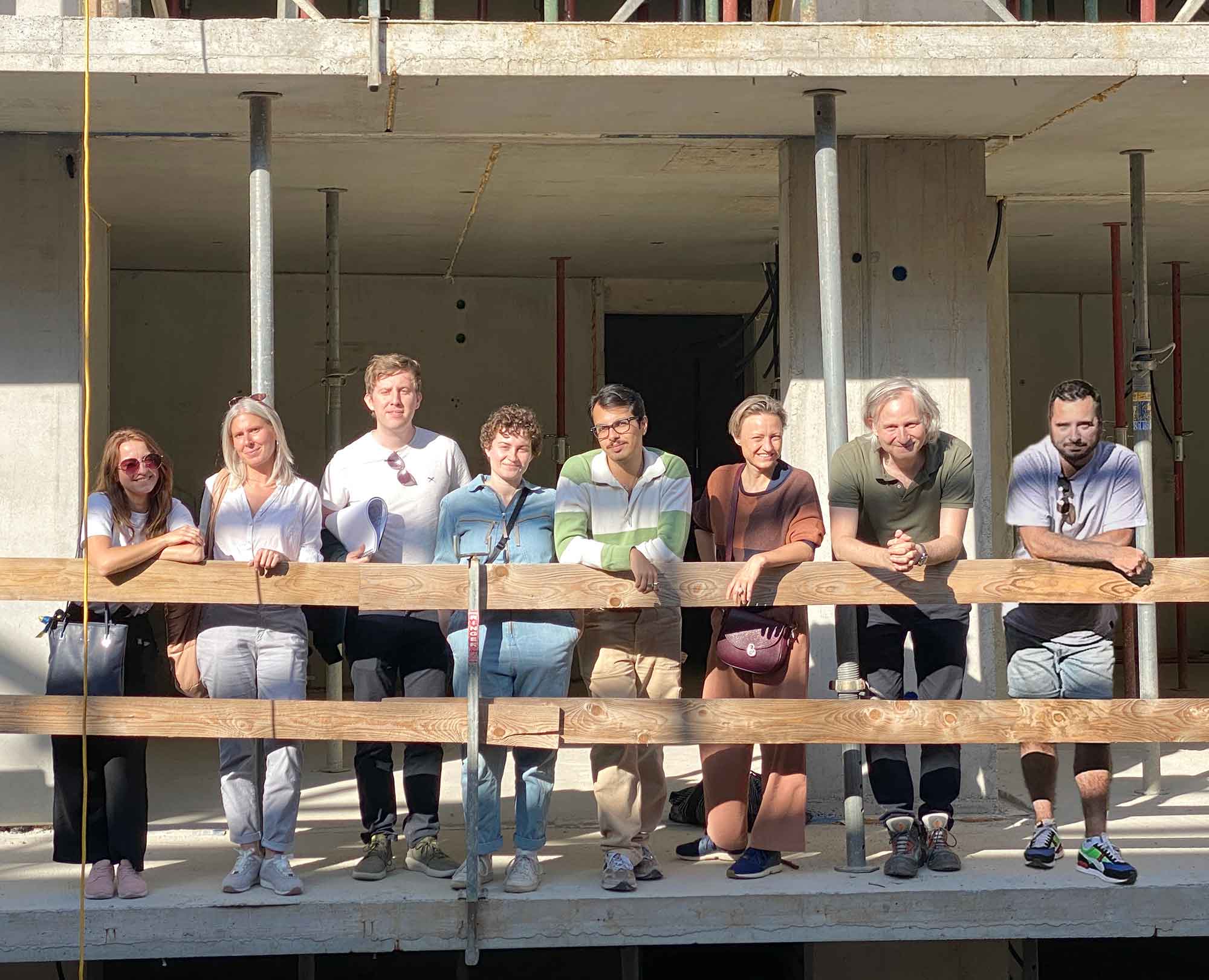
Some houses are like old buildings even before they are finished. Swiss architects once called them Räumlinge. The conversation with them can also be imagined as a dream, with familiar figures and strange little animals. The foyer as an old dancing bear in a blue trouser suit. The staircase is as wide and narrow as necessary, double doors open and close, friendly or serious, the hall in an austere costume that only shimmers when it is turned away. Some things are inscrutable or curious, you will come across rooms that you like one day and not the next, niches that you will sometimes avoid.
At the end of a project, the dream should remain invisible; just as one still notices the wind in the rippling water.
When asked about the ten most important buildings, a fellow student once said that first he had to name the apartments and houses of his childhood and youth, and only then did works of architectural history come to mind. Even if there is a stubborn inwardness in the answer, every room in a house should be treated as if it were of particular importance.
If there is an eyeless language that some writers fear falling back into, how would one recognize an eyeless and silent building? Rooms that don’t answer and don’t want to show themselves, in the dream this could be a mute person without a face or age who leaves you perplexed. The Russian architect Alexander Brodsky called one of his buildings, which seemed to him to be less successful than others, a house that still lacks a soul.
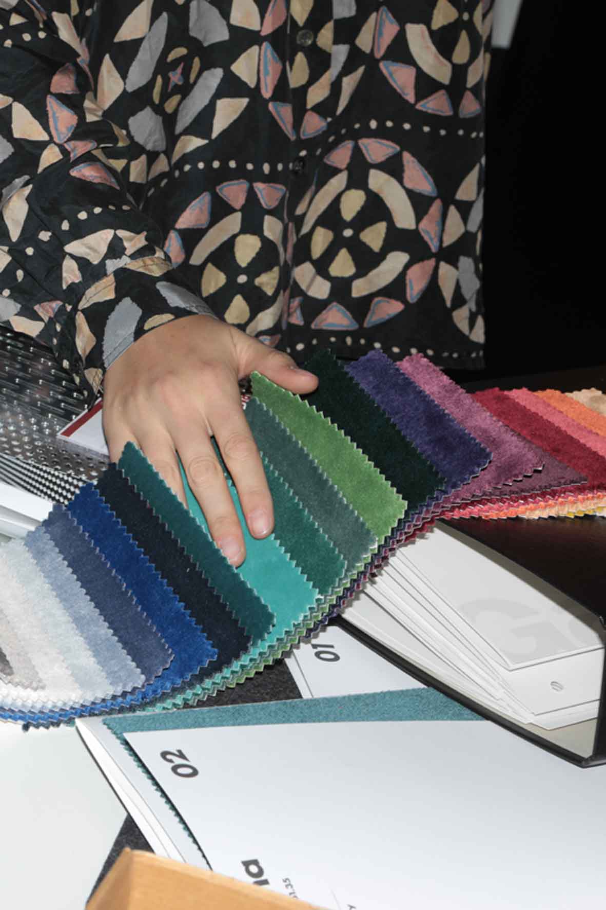
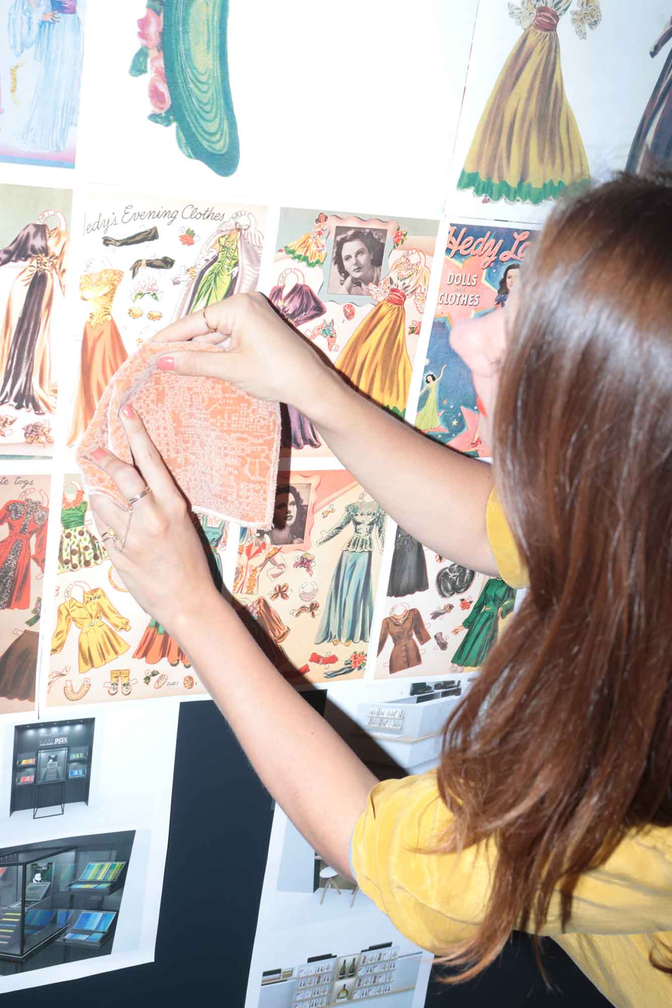
Unfortunately, Johanna gave up her plan to sew a separate dress for each project due to time constraints. She regularly emphasizes that she will make up for it one day; a little implausible.
An older colleague likes to say that of the hundred houses he had built, not a single one was like any other. He didn’t set out to do that, it just happened that way. You can find that nonsensical, or happy.
The metaphor of the home as a tailor-made suit is more reminiscent of a bygone era. Both should still sit well today, sometimes be comfortable and practical, sometimes sober and functional, and usually look good at the same time.
We would like to set a rule that at least one room in every house should be painted dark. We are still looking for an incontestable derivation.
Until 1257, the Cistercians were forbidden to use colors on their buildings. Necessity is the mother of invention, and every nuance seemed worth the effort: even lead glass panes were now tinted using the elaborate grisaille technique in fine gradations from clear white to gray to anthracite. So the ban remained half-hearted and was eventually lifted. Colors returned to the surfaces of the buildings.
Sunday, Monday, Wednesday: homely and colorful, dark grey and mustard yellow.
Tuesday, Thursday: daring and agile, ore red and petrol blue.
Friday, Saturday: moody, cheerful, erratic and simple, perhaps more in mint green and water gray. Sketch of the colors and moods of a week.
Free and artistic elements can be scattered throughout a project like butterflies. They come into contact with the user, perhaps as the shoehorn, to slip into the fray. This could be a talking clock or a flying lampshade.
As a traditional company name, the name Gebrüder Schuberth would have been obvious, but Gregor was unable to get away with it, and it would also have been incorrect.
How much contrast and contrast are necessary to create effect and drama is something we are always concerned with. Is it possible to imagine a harmony of opposites? A permanence and living force that grows from opposites? Whether you prefer to stir the uneven layers in Fru-Fru or spoon them out one after the other is a question of technique, taste or mood — in essence, our preoccupation.
Arch. Gregor Schuberth (Managing Director)
Dipl.-Ing. Johanna Schuberth
Gumpendorfer Straße 10–12/20
1060 Vienna
T +43 1 920 46 89
F +43 1 920 46 89 10
kontakt@schuberthundschu berth.at
www.schuberthundschuberth.at
Instagram @schuberthundschuberth
Twitter @undschuberth
UID no.: ATU 69071416 FN
422544p, Vienna Commercial Court




Webpage:
Architectural photos: Christoph Panzer, Franco Winter
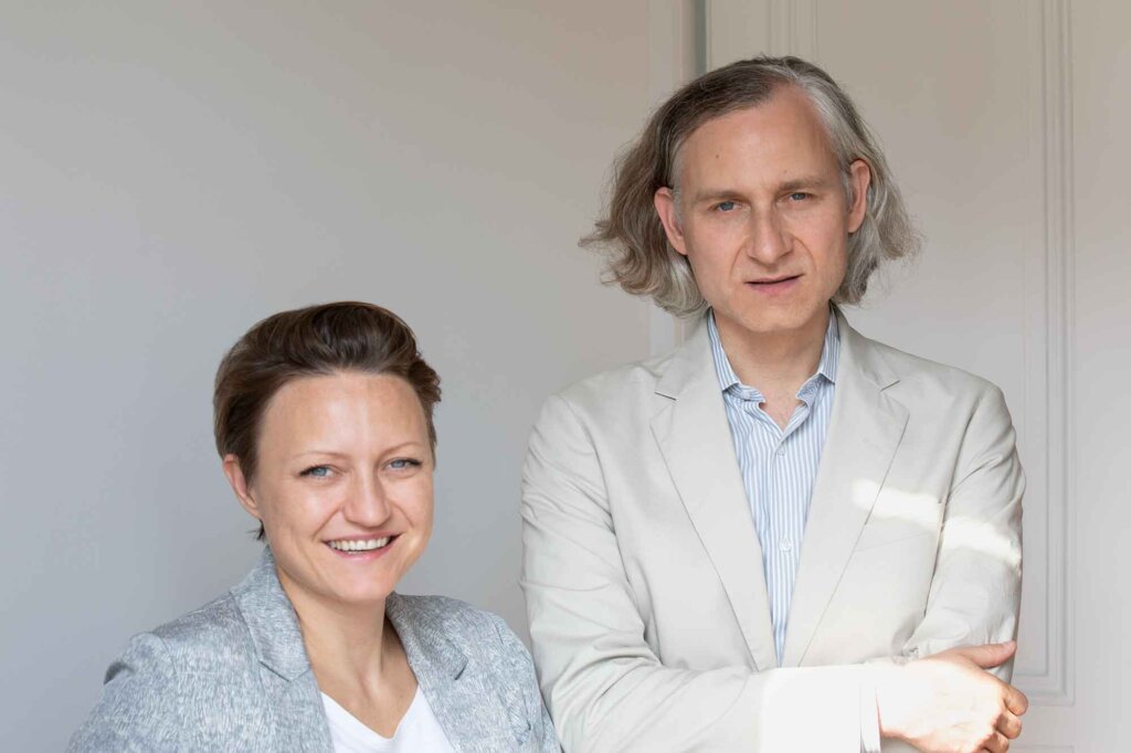
Team photos J. and G. Schuberth: Michael Dürr
Illustration: Mathias Fellner
Programming: Susanne Fröschl grafikdesign
Copyright © 2023, Schuberth und Schuberth ZT- GmbH, all rights reserved. The
contents of this website are protected by copyright.
The content of these pages may not be reproduced in any form or processed, copied or distributed
using electronic systems without written
permission.
The protection of your personal data is important to us. We process data exclusively within the framework of the statutory provisions (GDPR, DSG 2000, TKG 2003). Below we inform you about the most important aspects of data processing in the context of our website.
Contact with us:
If you contact us by e‑mail from the website, the data you provide will be stored by us for the purpose of processing your request and in case of further questions. We do not share this data without your consent. You can find our contact details in the imprint of this website.
Further information under “CONTACT”